How to Choose the Right Design Elements for Your Small Business: A Guide to Colors, Fonts, and Imagery
When it comes to building a successful small business, the design elements you choose can make or break your brand’s identity. Your website, logo, marketing materials, and overall aesthetic play a huge role in how customers perceive you. Selecting the right colors, fonts, and imagery is essential to communicating your brand’s message and connecting with your target audience.
This guide will walk you through the basics of choosing the right design elements for your small business and how they can help strengthen your brand.
1. Choosing the Right Colors for Your Brand

Why it Matters: Colors evoke emotions and can influence purchasing decisions. Different colors have different psychological effects. Choosing the right color palette will help convey your brand’s personality and values to your audience.
How to Choose:
Identify Your Brand’s Personality: Are you modern, playful, luxurious, or professional? Your brand’s personality should be reflected in the colors you choose. For example, blue often conveys trust and reliability, while yellow signals energy and positivity.
Understand Color Psychology: Consider what emotions different colors evoke. For example, green is often associated with health or nature, while red can signify passion or urgency. Align your color choices with the emotions you want your audience to feel.
Limit Your Palette: Stick to 2-3 primary colors for your brand. Too many colors can overwhelm or confuse your audience. A limited palette ensures consistency across all platforms, from your website to your social media.
Pro Tip: Use online tools like Adobe Color to create harmonious color schemes, or check out color palette inspiration sites like Coolors.
2. Picking the Perfect Fonts
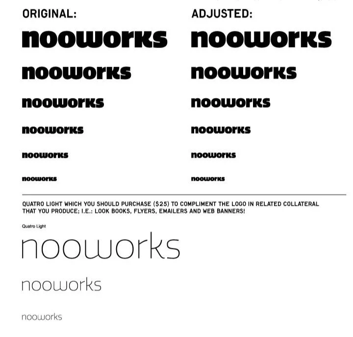
Why it Matters: Fonts are more than just words on a page; they set the tone for your brand’s communication. The right font choices can make your business appear professional and approachable, while the wrong choices can feel off-brand or amateurish.
How to Choose:
Define Your Brand’s Tone of Voice: Are you a fun, creative brand or a serious, corporate one? Your font choices should align with the tone you want to project. For example, sans-serif fonts like Helvetica or Arial are modern and clean, while serif fonts like Times New Roman evoke a more traditional, authoritative feel.
Ensure Readability: A great font is one that’s not only stylish but easy to read across different platforms and devices. Avoid fonts that are overly ornate or difficult to decipher, especially in smaller sizes.
Pair Fonts Thoughtfully: Use a maximum of two or three fonts: one for headings and one for body text. It’s essential to create visual contrast between fonts without making them clash. For example, pairing a bold, modern headline font with a simple sans-serif body font can create a clean, professional look.
Pro Tip: If you’re unsure which fonts to pair, read Google Fonts’ article about pairing fonts.
3. Selecting the Right Imagery for Your Brand

Why it Matters: Imagery is a powerful tool for storytelling. Whether it’s photos, illustrations, or graphics, the visuals you use help shape how customers perceive your brand. The right imagery can build an emotional connection, while the wrong choices can alienate or confuse your audience.
How to Choose:
Stay Consistent with Your Brand Identity: Your images should reflect your brand’s overall style. If your brand is sleek and modern, choose clean, minimalistic visuals. If you’re more playful or creative, opt for bright, dynamic imagery.
Use High-Quality, Professional Images: Low-quality, pixelated images will damage your credibility. Invest in professional photography or stock images that align with your brand. You can also use custom illustrations to add a unique touch to your visual identity.
Keep Diversity in Mind: Especially in today’s market, it’s crucial to ensure your imagery represents a diverse and inclusive audience. Make sure the people in your photos reflect your customers and your values.
Pro Tip: Websites like Unsplash and Pexels offer free, high-quality images that you can use to enhance your brand’s visuals.
4. Create a Cohesive Design System

Once you’ve chosen the right colors, fonts, and imagery, it’s important to create a cohesive design system that keeps your brand’s visual identity consistent across all platforms.
How to Build Consistency:
Create a Style Guide: A style guide documents your brand’s design elements (color palette, fonts, imagery, and logos) and how they should be used across different media. This ensures everyone who works on your brand knows how to maintain consistency.
Use Templates: For social media posts, emails, and marketing materials, create templates that follow your brand’s design guidelines. This saves time and ensures that everything looks unified.
Conclusion: Design with Intention

Choosing the right design elements for your small business is an essential step in building a strong and memorable brand. Your colors, fonts, and imagery should work together to communicate who you are and what you stand for. By focusing on consistency and aligning your design with your brand’s personality, you can create a cohesive visual identity that resonates with your audience and supports your business growth.
Remember, design isn’t just about looking good—it’s about communicating effectively. When done right, your design choices will not only attract customers but also build trust and loyalty over time.