





Boheme Retreats
Brand Identity · Art Direction · Graphic Design · Merchandise
The Brief
Boheme Retreats, a retro camping experience in Upstate New York, needed a logo that captured the personality of its collection of vintage campers and the inclusive, community-driven experience built around them.
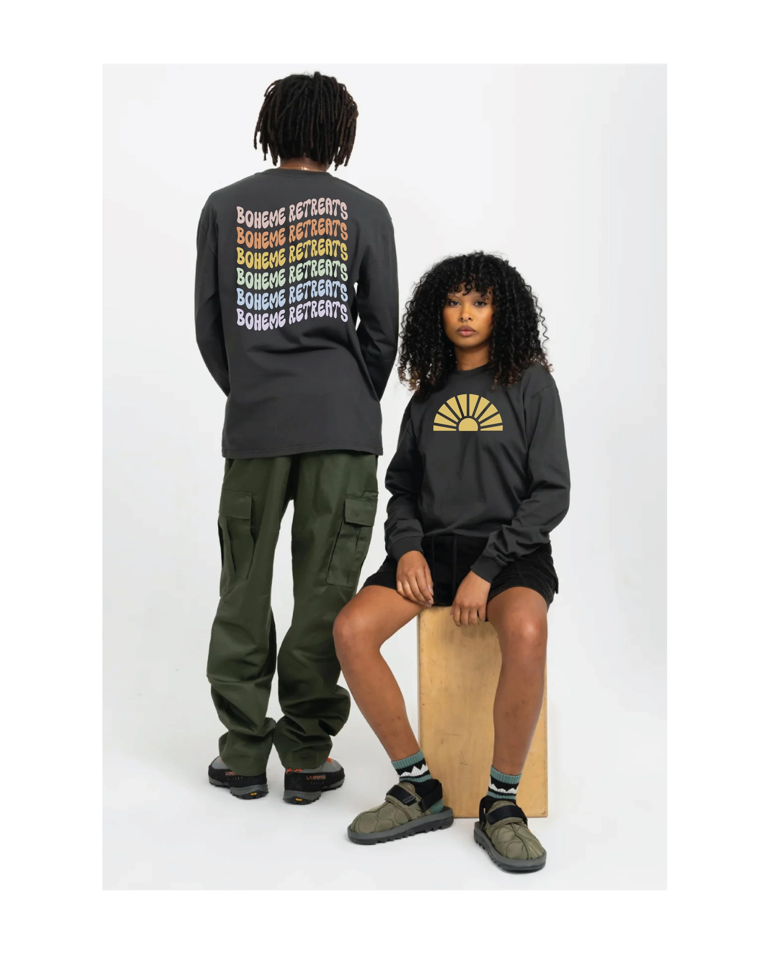
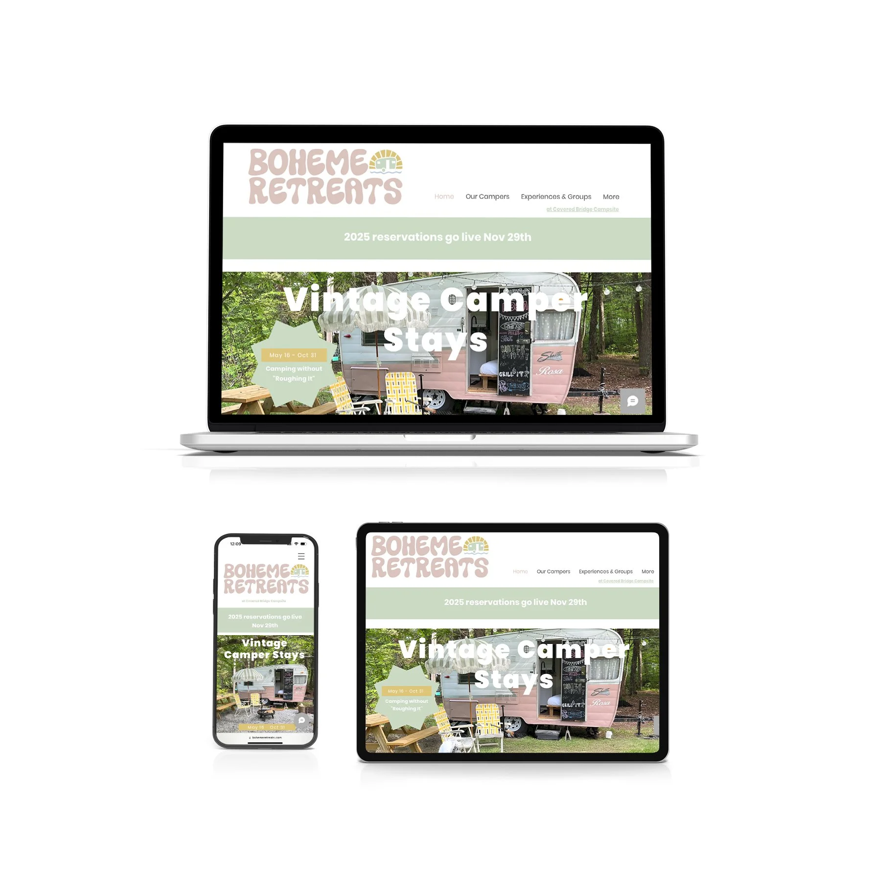
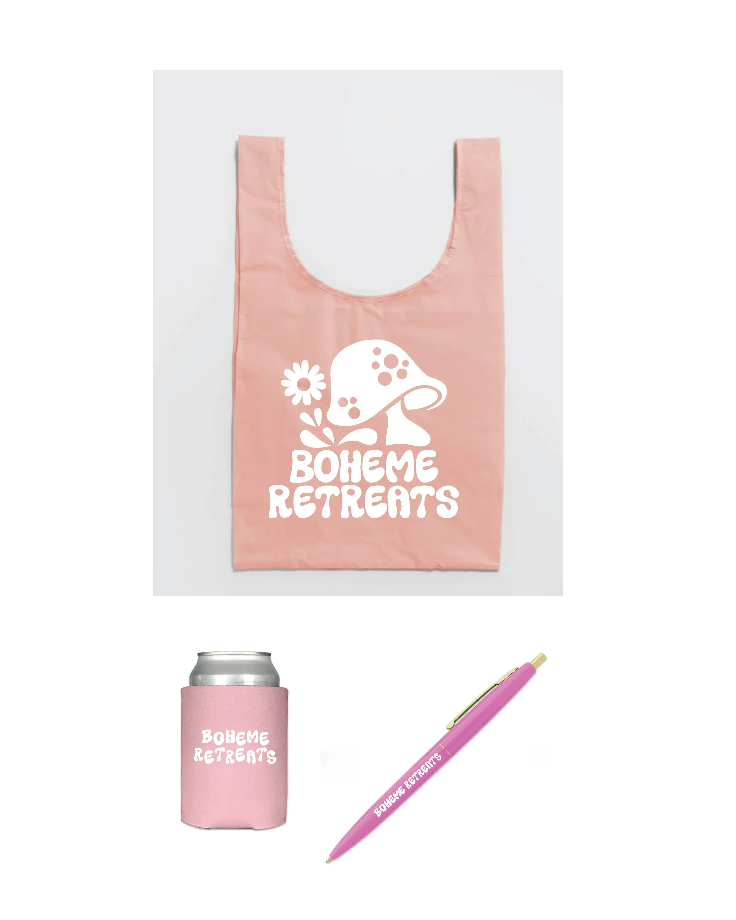
What began as a logo project quickly evolved into the development of a broader visual identity—one that could express the playful, nostalgic character of the brand across digital, print, and merchandise.
The Approach
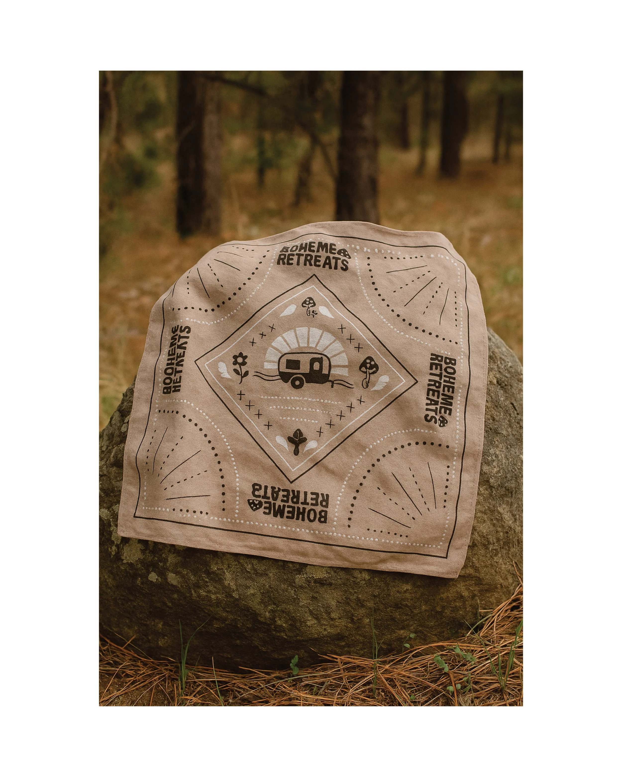
Drawing inspiration from vintage travel graphics, camping culture, and the visual optimism of the 1960s and ’70s, the identity combines bold typography, warm color, playful shapes, and repeat patterns to create a distinctive but flexible brand system.
A family of primary and secondary marks, graphic elements, patterns, and color combinations allows the identity to shift across applications while remaining immediately recognizable as Boheme Retreats.
Role & Execution
Brand strategy, creative direction, logo design, visual identity, color and typography systems, pattern development, brand guidelines, digital design, and merchandise design.
Project Note
The evolution of Boheme Retreats from a single logo into a complete visual world is what makes the project particularly special. The identity has enough structure to remain consistent while still leaving room for experimentation, play, and the individual personality of the brand.