




SPARSA
Brand Identity · Creative Direction · Web Design & Development · Interior Design · Social Media
The Brief
SPARSA is a wellness and yoga studio in Greenpoint, Brooklyn, created as a space for community, movement, healing, and independent wellness practitioners.
The project called for more than a visual identity. The goal was to create a complete brand experience—from the logo and digital presence to the studio environment itself—that would feel calm, considered, welcoming, and connected across every customer touchpoint.
The Approach
The visual identity began with a logo designed around the ideas of release, connection, and returning to oneself. From there, the brand developed into a broader visual and spatial language that could move consistently between digital communications and the physical studio.
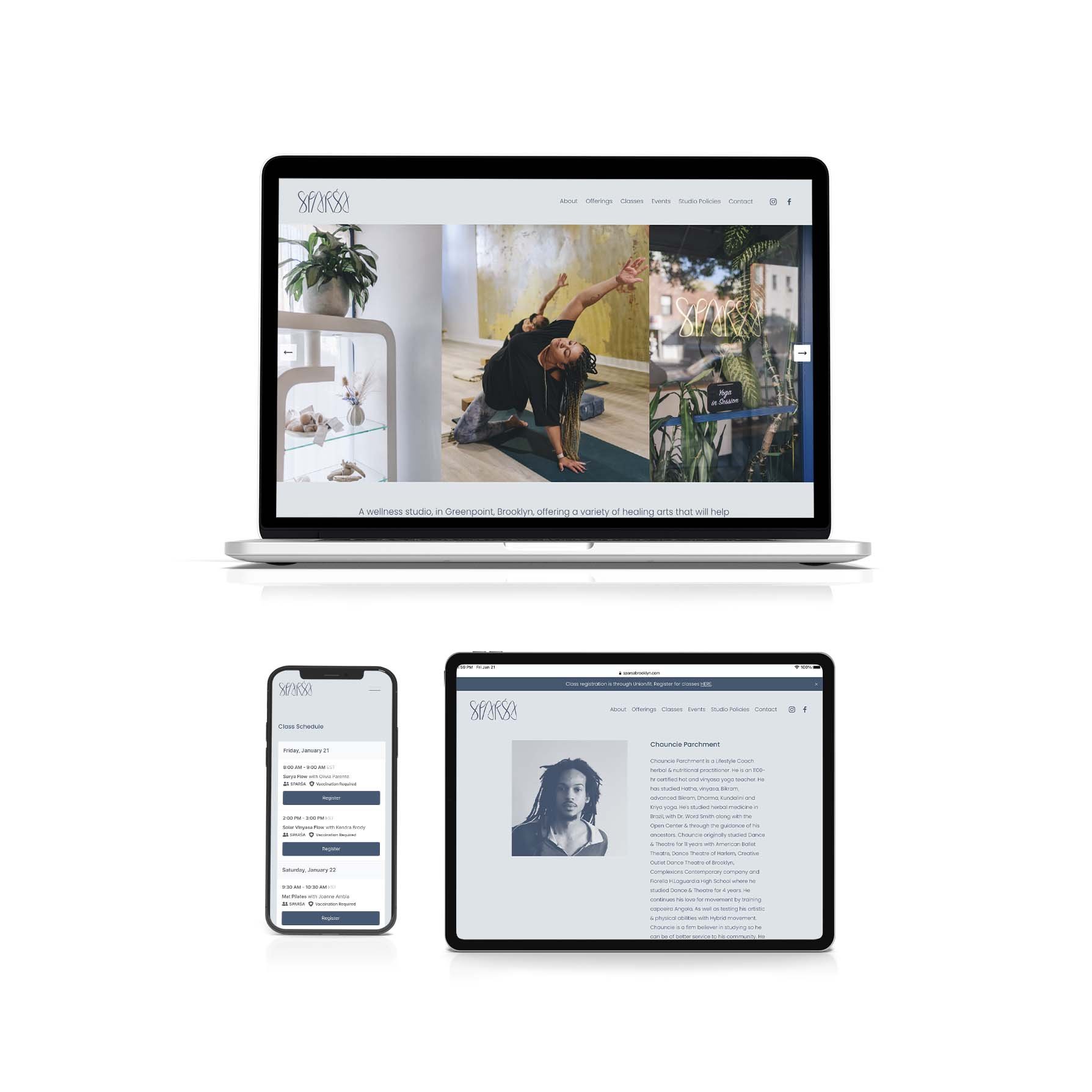
A responsive website was designed and developed to support the operational needs of the business, incorporating class and appointment booking, e-commerce, forms and submissions, editorial content, and an events calendar.
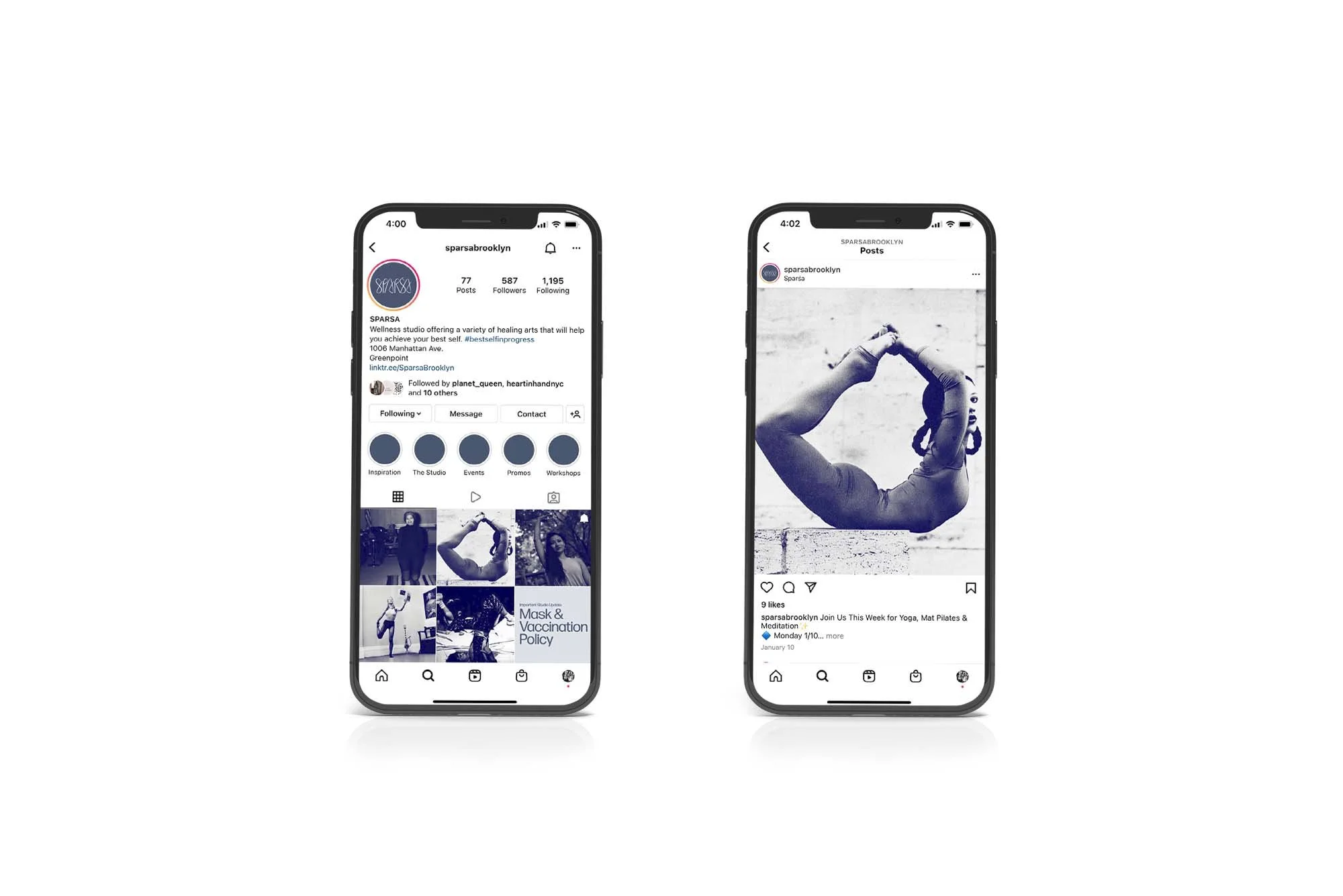
The identity was extended across social media, maintaining a consistent visual presence across Instagram, Facebook, and TikTok while supporting ongoing classes, events, practitioners, and studio programming.
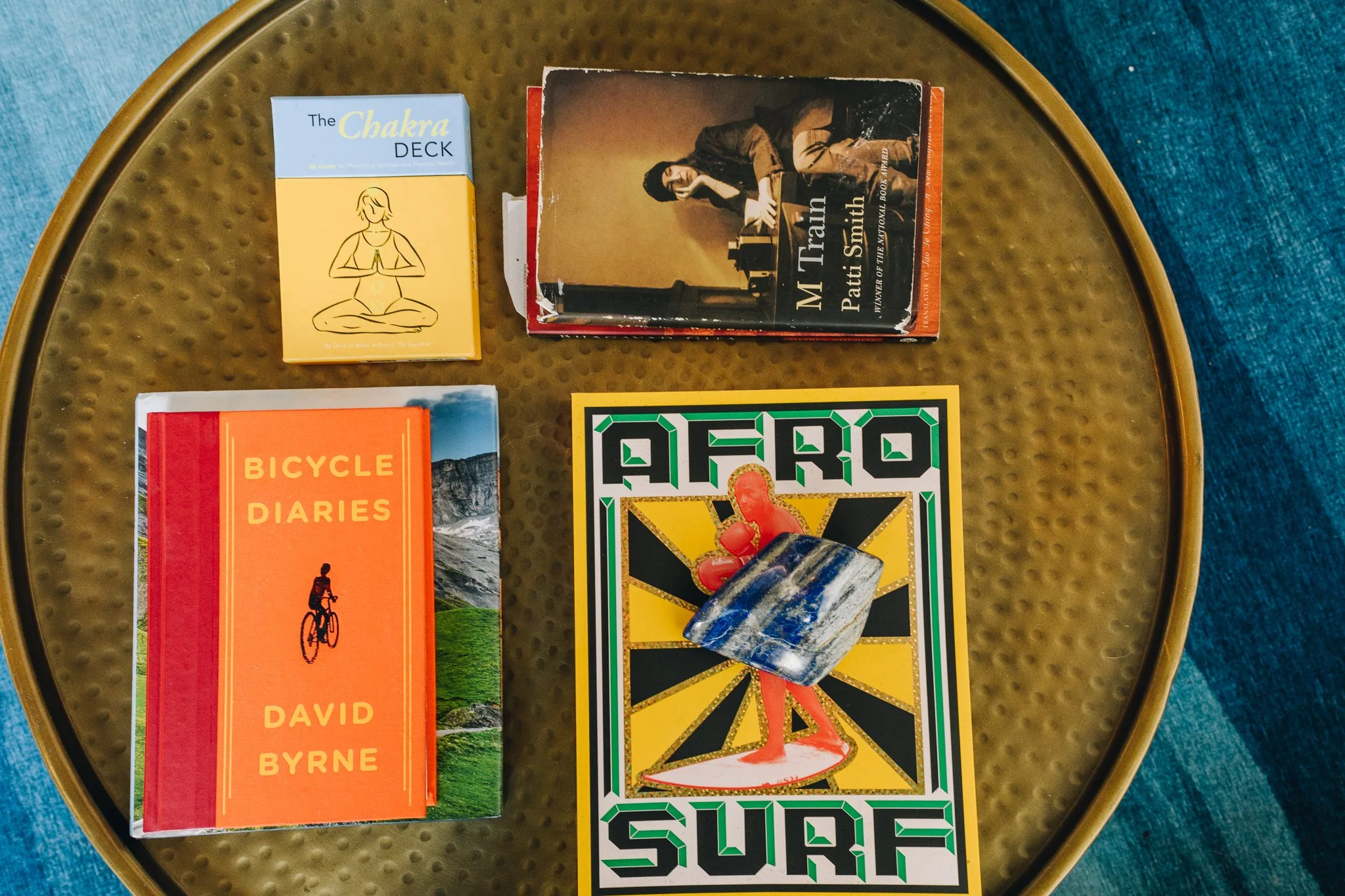
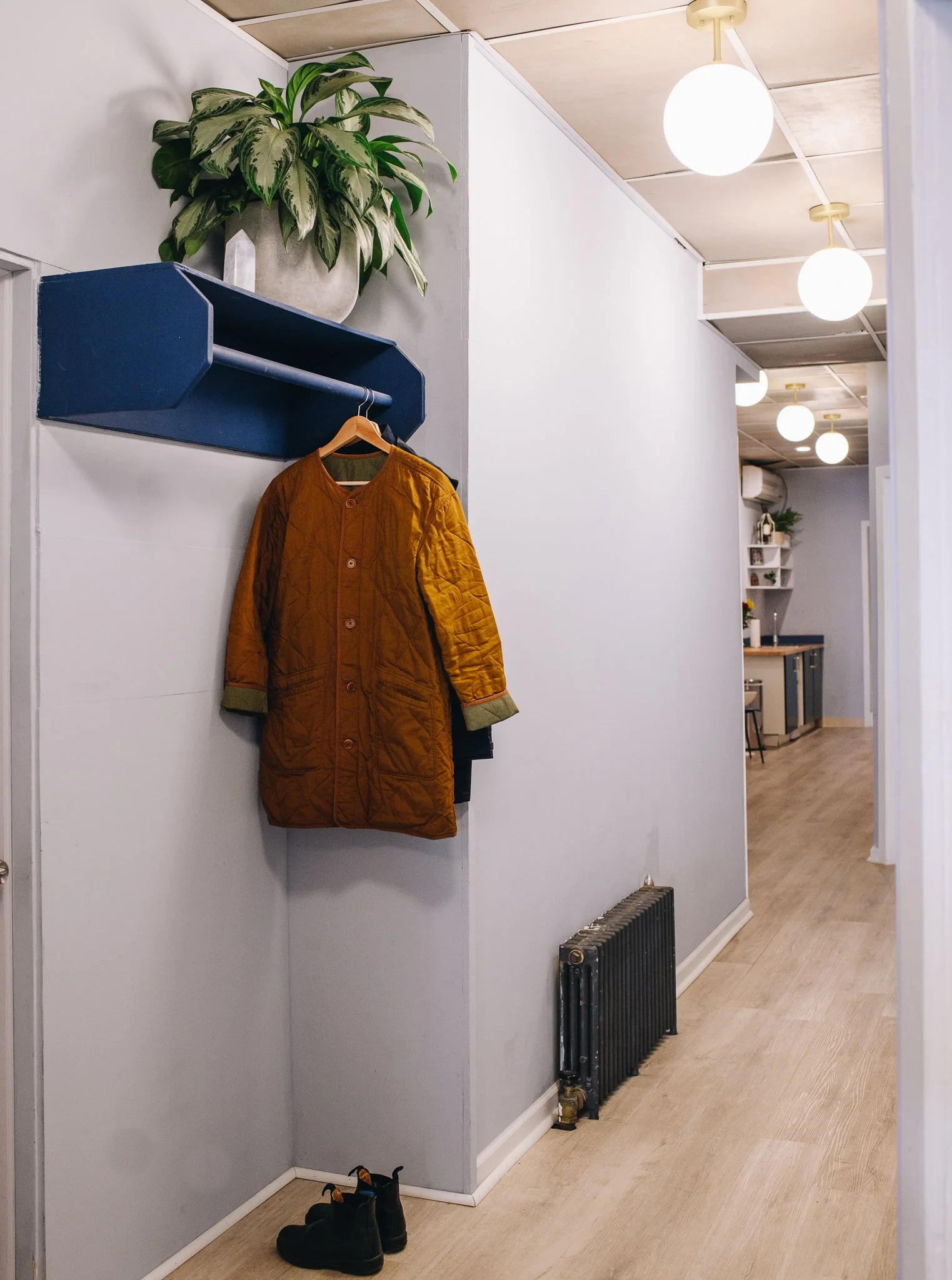
The physical environment became another expression of the brand. Interior spaces, signage, finishes, furnishings, and curated objects were considered together to create an experience that felt cohesive with SPARSA’s visual identity—from the gold mirror-finish window signage and lobby to treatment rooms, kitchenette, and movement spaces.
Role & Execution
Creative direction, brand strategy, logo design, visual identity, web design and development, responsive design, booking and e-commerce integration, social media strategy and management, content creation, environmental graphics, signage, interior design, spatial styling, and brand implementation.
Project Note
SPARSA offered the opportunity to consider a brand as an entire experience rather than a collection of individual design elements. Digital, physical, and environmental touchpoints were developed as parts of the same visual language, creating consistency from the first online interaction through the experience of entering and spending time within the studio.
The project demonstrates how thoughtful brand systems can extend beyond graphics—shaping how a space looks, feels, communicates, and functions.